Let’s have a look at the role that colour plays in creating outfts – understanding how to put colours together in different ways can really help us to create stunning and stylish outfits, and can also have a positive influence on our mood and well-being.
By understanding the concepts of colour theory in styling, you can create clothing combinations that flatter your figure, and make a statement with your wardrobe. Let’s have a look at the three main colour schemes, the emotions associated with different colours, and practical tips for choosing the right colours in various situations.
3 Ways to put Colours Together to create Eye Catching and Aesthetically Pleasing Outfits
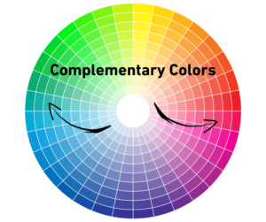
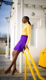
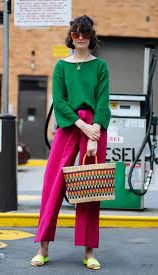
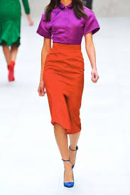
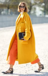
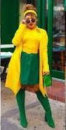
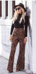
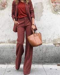
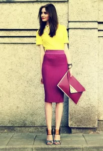
Complementary colours
are pairs of colours that sit opposite each other on the colour wheel and create bold, eye-catching contrasts within an outfit. For example, red and green, blue and orange, or purple and yellow are complementary colour pairs. These are a sure-fire way to turn heads!
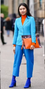
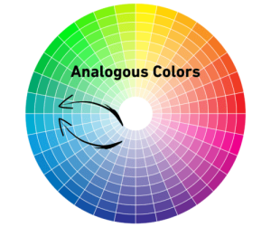
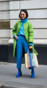
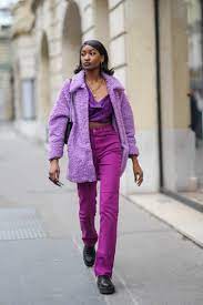
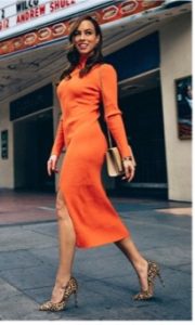
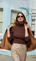
Analogous colours
are ones that sit next to each other on the colour wheel, such as blue, green & teal, yellow and orange, or red and pink. These colours share similar undertones and therefore create a harmonious and effortlessly chic look.
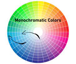
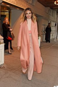
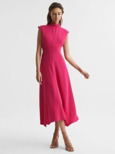
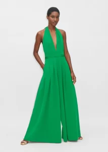
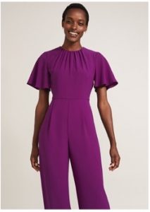
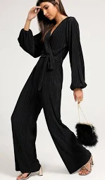
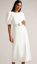
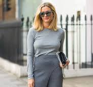
Monochromatic colour
schemes create a simple and elegant look by putting together different shades, tints, or tones of a single colour. Imagine a gorgeous ensemble in various shades of blue. When creating a monochromatic look, it’s important to add visual interest by incorporating different textures and patterns.
How to Wear Colours to Enhance your Mood and Well-being
So what emotions do different colours mean? Wearing certain colours can have a beneficial, psychological effect on your emotions.
Each different colour evokes different emotions or feelings which means that you can actively and mindfully select colours to wear to enhance your mood and create a positive effect on those around you.
Generally speaking, colours at the warmer end of the spectrum such as reds, oranges, yellows are associated with energy-giving emotions whilst cooler colours generally associate with more relaxing, calmer emotions.
Here are some emotion associations:
|
||||||||||||
How to Use Colour to Enhance your Figure
You can also utilise the power of colour to impact how your figure is seen – you can use colour to make yourself taller, slimmer, more curvy or shorter.

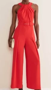
Slimming Effects
Darker colours will create a slimming effect by minimising the areas that they are worn on whilst lighter brighter colours will draw the eye. For example wearing a brightly coloured top with darker coloured bottoms will draw the eye upwards whilstcreating a slimming effecton the lower body. If you wish to reverse this, wearing a brighter colour or pattern on your bottom half, with a darker colour on the top half, will draw the eye downwards and away from your top half.
Lengthening Effects
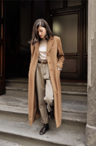
To create a taller slimmer silhouette, wearing one colour from head to toe will create the effect of a vertical line, making you look taller and slimmer – continue the colour through to your footwear to add even more height to your frame.
Curve Creating Effects
Colour blocking is a great way to break up your height and also to create curves for those with less curvy shapes.